Logo design for a leading quality management system in healthcare
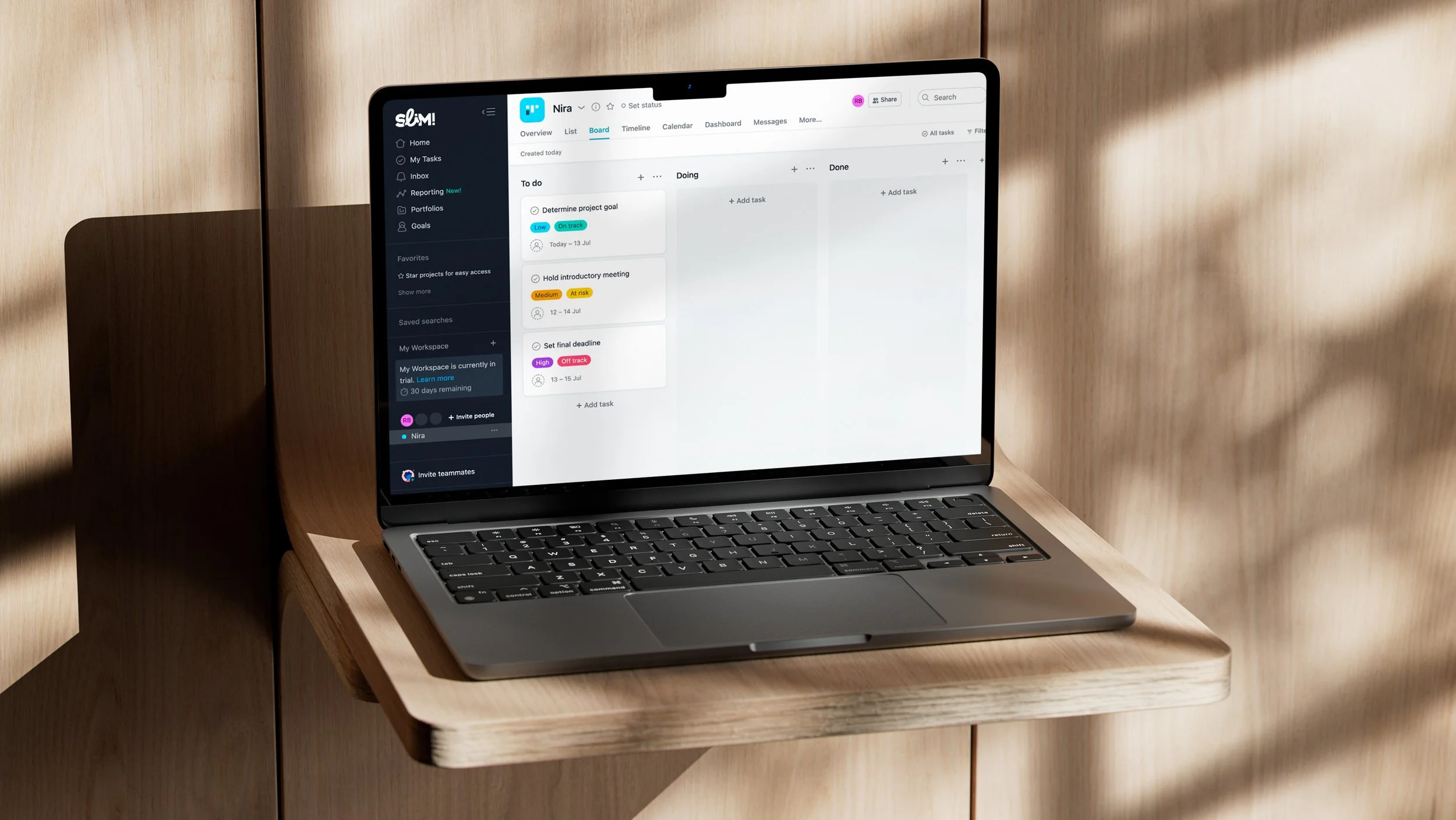
For SLiM!, the innovative quality management system by KliXOnline, I had the pleasure of designing a new logo. With the main goal of capturing the feeling of 'connectedness and flowing continuity' within SLiM!, I deliberately opted for a design that embraces the familiar elements of Buro Klix’s branding, but with a subtle twist. The connection between the letters L and i symbolizes a fusion of strength and fluidity. The result? A refreshed logo that not only reflects the essence of SLiM!, but also radiates the vitality and professionalism of KliXOnline in an energizing manner.